
Do you remember the early days of the internet, when pages were just text? And then we got thumbnail photos, and people started using blinking comic sans in red with yellow outlines for their headers, just because they could?
Compare that to modern web pages which are much, much more readable. Just like good paper brochures or magazine pages, they combine different headings and sub-headings, different sizes of font, with pictures, color, infographics. They are set out in a way that lets your eyes wander across the page till you pick out what you’re interested in.
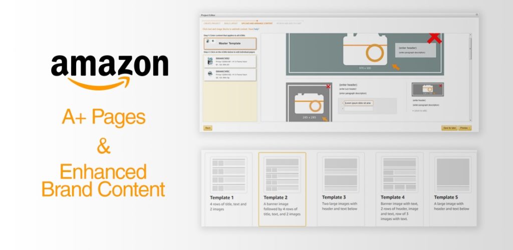
That’s pretty much the way A+ content differs from basic Amazon listing pages. They look better – but they’re also organized in a way that lets the viewer find what they’re looking for really quickly.
No wonder Amazon says they can increase your sales by up to 12 percent.
However, just throwing in more images and a video and a load of infographics won’t automatically get the best out of A+ content. So here are our tips for creating compelling content that will give your sales a boost.
• Think about your customers. The typical product listing doesn’t give you a lot of room to address different uses of the product or different customer segments, but with A+ content you can do this. For instance, if you’re selling cosmetics, you can use A+ content to show how your product helps both younger and older women look their best.
• A video can help show your customers how to use the product, or how it works – for instance, how to use a spiralizer. Set the video in a pristine, attractive kitchen with a personable demonstrator and you’ve achieved two things – fitting your product into a lifestyle and ensuring customers don’t give you bad reviews because they can’t figure out how to use it properly.
• Make the whole page work as a unit. That means getting all the visual details right. Colors need to match your brand. Adventure kit might have strong and quite dark colors; funky colors or pastels will give very different messages about your brand. You also need the font you use for text to align with your brand statement. If your product is about minimalism, simplicity, and Zen, don’t use a script font with a lot of curlicues!
• You also want to make sure that all the text in your A+ content relates clearly to the images. This sets up a virtual circle; the viewer looks at the image, looks at the text, finds that it adds detail to what was in the image, and so when they look at the next image they’re going to read the text next to that, hoping to get more information. But if your text isn’t linked to the images, you don’t get that positive feedback loop.
• Think of the A+ content as taking your potential buyer on a journey – what do you want them to see first? And then what next? How can different viewers explore the page?
• Focus the page clearly on your Unique Selling Proposition (USP). What’s different about your product? Stress the benefits, and keep your text short. Four benefits work nicely – for instance with herbal tea, you might use four pictures. First, the herbs you use (benefit, they are relaxing); then the muslin bag (benefit, it’s cute and it’s sustainable); then a lifestyle pic of two people enjoying the tea together (benefit, tastes great); and finally your brand logo and an explanation of your brand values (making life more enjoyable).
• Use banners to divide up the page clearly. It’s like having chapter headings in a book – it shows the viewer where to find particular information.
Get your A+ content right, and you’ll build brand loyalty, as well as increase conversions and increase your return on PPC advertising. It’s well worth doing – and it’s worth using a freelance design/graphics professional, if that’s not your forte, to make sure it’s done right.